Market Research
KAA conducts regular scientific market research surveys and analysis of different markets. KAA focuses on surveys that provide clients with information that is vital to the planning of market strategies. Action-oriented surveys directly provide the client with a set of short and long term recommendations.
Market research is basic research with an overriding requirement to have direct business application. For research to be of any use it should follow laborious narrowly defined scientific methodology. Otherwise the results could be useless or, worse, wrong. An effective market research project is composed of two separate segments: the scientific and technical research segment, and the applied and business-oriented segment.
Here at KAA, Inc. we have been providing professional analytical services for a variety of multi-national, national and regional corporations since 1988. We make sure that the surveys are designed and conducted in accordance with technical and analytical requirements to provide the client with results which have scientific accuracy and statistical significance. We usually assign more than one Ph.D. to each survey, at least during the early stages of design and development.
Advertising effectiveness
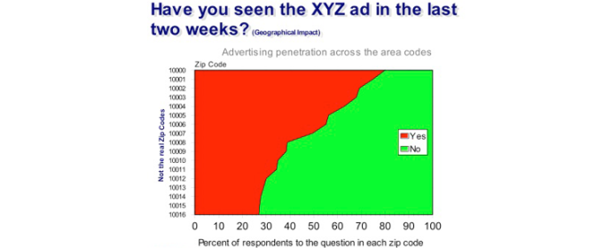
How effective your advertising is, depends to some degree on the location. As an example we used the actual results of a study and for purposes of confidentiality we changed the zip codes. In our analysis we found that close to 80% of the respondent in one zip code had seen the ad, compared to between 20-30% of the respondent in another zip code. This clearly reflects that the impact of any advertising campaign is not uniform, and that an independent review provides positive proof of its real impact along geographic regions.
Trade-off between annual fee and fee per transaction of ATM
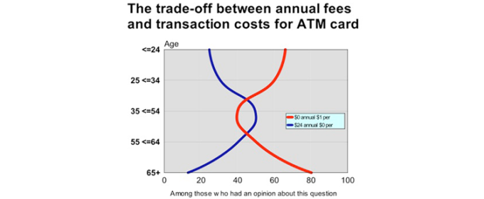
This is the result of an actual study done a few years back when banks used to regularly charge user fees for the use of their ATM. Two options were offered to customers of the bank, either pay $24 per year for unlimited free withdrawals or no annual fee but pay $1.00 per withdrawal from the ATM. Most of the younger and older customers wanted no annual fees and most of those in the middle wanted to pay a single annual fee for unlimited free withdrawals. Our client was then able to use these results to design fee structures most satisfying their customers.
Nonlinear correlation
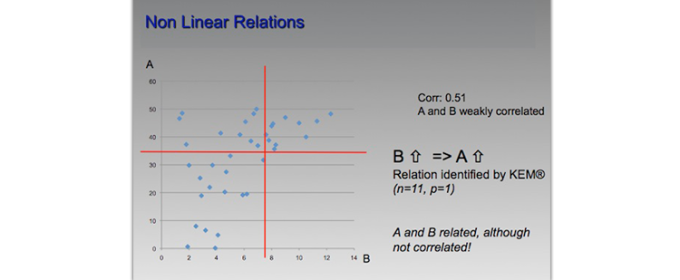
The traditional way to look at statistical relationships is based on linear correlations, that is if B goes up, for a large percentage of times A rises also and if A goes up for the same percentage of times B would rise also. There are relationships where the two way street is not in existence. For example, this chart shows the results of a study which has nonlinear correlation, in this case as B goes up so does A in almost every case, but when A goes up, B does not necessarily rise. In a traditional sense these two variables are not all that correlated and are usually overlooked, however, in the nonlinear world there is a very high correlation; almost every time B increases so does A, while the reverse is not true.
Customer Loyalty Index
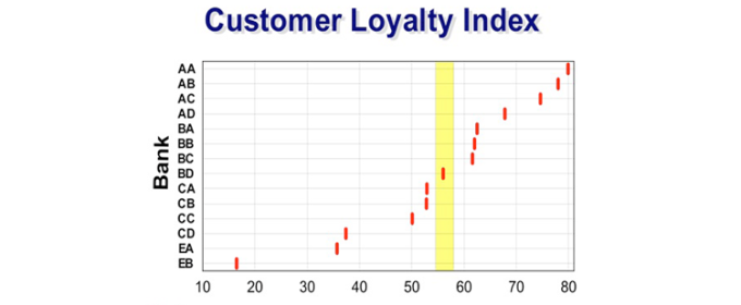
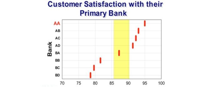
This is the result of a competitive market research study which clearly shows that Banks AA, AB and AC have significantly higher customer loyalty than the rest. And also it points out banks BB, BC and BD, which have significantly lower customer satisfaction than the rest, and thus presents a good potential for pouching customers.
Nonlinear correlation
The traditional way to look at statistical relationships is based on linear correlations, that is if B goes up, for a large percentage of times A rises also and if A goes up for the same percentage of times B would rise also. There are relationships where the two way street is not in existence. For example, this chart shows the results of a study which has nonlinear correlation, in this case as B goes up so does A in almost every case, but when A goes up, B does not necessarily rise. In a traditional look this two variables are not all that correlated and are usually overlooked, however, in the nonlinear world there is a very high correlation there; almost every time B increases so does A.
Percent of Dissatisfied Customers
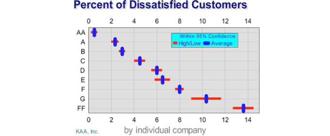
This is the result of a competitive market research study which shows the huge differences between the level of customer dissatisfaction among the companies in the survey. To show the differences, it is sufficient to point out that the percentage of dissatisfied customers of company OFF has 14 times that of company AA. Wouldn’t you like to know where your company stand in the market?
Percent of customers who switched to another company last year
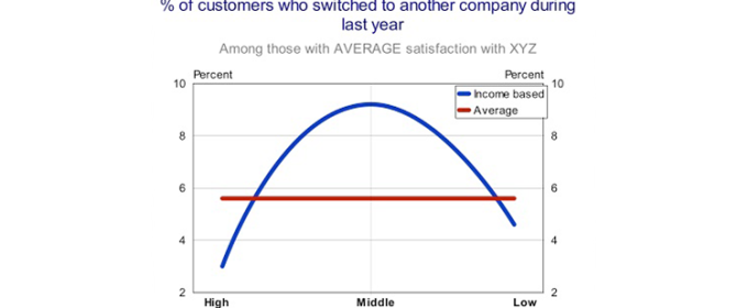
A little less than 6% of XYZ customers who marked their satisfaction with the company as average, switched to other competitors. This sounds straightforward, until we dig into the details. There is a nonlinear relationship between switching companies and income. Among those with average satisfaction with XYZ, close to 5% of those in the lower income bracket and 3% of those in the upper income bracket switched to competitors. However, the defection was a much higher 9% among those in the middle income group. Looking at the ratios, those in the middle income group were 3 times as likely to jump ship than those in the upper income group. What are the underlining factors for this significant difference?